BECU Digital Design Toolkit
The design toolkit is a Figma library that can be referenced and enabled in your projects.
Open in FigmaRelease Notes
What's New
- Font stack update. The Design Toolkit 1.7 uses Public Sans as the main font family. The new font stack is easier to read, improves distinction among letters and does not contain unnecessary visual clutter that detracts from comprehension.
- Versioning control. Added timestamp to guidelines to indicate the last updated time in preparation of versioning control in future releases.
What's Improved
- Navigation revision. Updated Navigation to latest font update.
- Right sidebar revision. Updated Right sidebar to latest font update.
- Link revision. Updated link default and hover state to underlined.
What's New
- Expanded text style asset to include Public Sans font stack text style to DTK library, in preparation for typography stack update and adoption in the next release.
- Link revision. Revisited link component with updated best practice & recommendations.
- Button revision. Revisited button component with updated best practice & recommendations.
- Incorporated over 140 new and updated icons, including new brands, transportation options, numbers and letters, and so much more.
- Added ATM card to the Branding library with updated promotional branding assets.
What's Improved
- Added link hover state for Alert component to indicate system response when hovering on the link in an alert.
- Removed unused styles from the design toolkit.
- Updated border color and focus state on card components to match in-production.
- Updated modal text color to align with DTK defined text color style.
- Updated input fields label style to improved form label consistency.
- Fixed bugs causing DTK prototype not to update and provided documentation of new process of release to alleviate bugs.
- Updated variant interactions among all complex components available in DTK (such as accordion and selection tile) to increase prototype efficiency.
- Updated and removed all font and color styles that are not defined in DTK library, that were causing unstyled asset specs in DTK library.
What's New
- A brand new navigation experience for the Design Toolkit (DTK).
- A brand new Pill component with variants. A documentation page explaining how to use the Pill component, with complete anatomy, placement, and accessibility specifications.
- A library with spacing and grid standards. The library explains how to use the standards to prototype with consistent whitespace and page structure.
- A library with updated Third-Party System User interfaces. The library makes it easy to prototype experiences for iOS, Android, and Chrome browser contexts.
- Created an experimental, alpha style guide for DTK 2.0.
What's Improved
- Improved guidance on how to design Context-Switching links for external solutions, hosted solutions, direct documents, and documents embedded in a window.
- Expanded the Branding library with promotional branding such as card designs and logos from KEXP, Seahawks, UW, and WSU.
- Enhanced Modal options with a Scrim. Scrims serve to make the content behind Modals less prominent. Created Scrim usage guidelines.
- Improved iconography standards for triggering Popovers and Tooltips.
What's New
- A brand new Modal component with 40 variants. A documentation page explaining how to use the Modal component, with full accessibility specifications.
- Created a convention for naming layers and variants in components. Produced documentation explaining convention and how to use it.
- Created a convention for how to write documentation pages.
- Created guidance for cleaning up documentation pages of unused or unlinked components.
What's Improved
- Updated Alerts and Notifications icons to the correct icons and color. Improved documentation by reordering variants by severity. Improved component layer terminology.
- Improved how Selection Tile variants work.
- Added more Popover variants. Redesigned Popover base layout. Simplified positioning options, and updated the default position order.
- Redesigned Tooltips. Improved tooltip usage guidance.
- Further distinguished Popovers from Tooltips with improved guidance.
- Removed unnecessary abbreviations from the documentation.
- Improved process documentation, with more articles and videos.
- Cleaned up the Figma library from unused or unlinked components.
What's New
- Two new List components along with usage and accessibility guidelines for Basic and Custom Lists. The Basic List and the Custom List come with 16 variants total.
- Two new Step Tracker components along with usage and accessibility guidelines. The small and regular Step Trackers come with a multitude of variants for flexible use.
- A new Breadcrumb component with many variants for Compact and Extended use and multiple levels. Defined usage and accessibility guidelines.
- Established a standardized approach to drop shadow styles along with best practices.
- A Horizontal Rule component to separate components or areas of a layout.
- A Vertical Navigation component.
- Created components with the most common text combinations (Headings and body text).
What's Improved
- Variants for disabled with deselected states in Checkboxes and Radio buttons.
- Added a new blank variant to Tooltips, accommodating icon, link, and button use cases. Updated the behavior of Tooltips.
- Selection Tiles now have interactive variants, supporting hover and click. Horizontal selection tiles now have an option that doesn't use iconography.
- Updated drop shadow styles to provide better UI alignment across components. Updated components include cards, interactive icons, tooltips, and selection tiles.
- Reworked Alerts components for responsive layouts.
- Updated Links usage guidelines with more examples and more detailed behavior recommendations.
- Included Stone as an accepted Button color and more examples of Buttons usage.
What's New
- Two new card components and expanded cards usage guidelines.
- A missing font style used in card components.
- Badge component and usage guidelines for it.
- Two selection tile components have been added, along with usage guidelines.
- Two components, along with guidelines, have been created to standardize the design of right sidebar boxes in Online Banking.
- One new component for popovers (icon & fly out menu), along with usage guidelines.
- One new component for a 'more' menu (icon & fly out menu), along with usage guidelines.
- A Bootstrap icon library ready to use on Figma, containing over 1,300 icons with variants (outline, fill, enclosed, etc.).
- Implemented a modular approach to embed icons coming from the Bootstrap library into the Design Toolkit. The new approach uses an 'Icon Wrapper' with out-of-the-box, standard icon sizes and padding areas.
- Multiple button variants with icons for mobile and desktop, incorporating Icon Wrapper.
- Established a unified approach to Focus states.
- Focus state variant added for desktop buttons.
What's Improved
- Fields and controls now have more features to handle input validation.
- Improved multiple Notifications and Alerts components, along with best practices.
- The new Icon Wrapper improved multiple components (Alerts, Forms, Popover, Related articles) with more to come.
- Reviewed all buttons, bringing consistency to layer naming structure and variant properties.
- Focus state was updated to provide better UI alignment across components. Updated components include cards, form components, interactive icons, buttons, links, and selection tiles.
FAQs
If you have questions that cannot be answered below please contact the UX CoE Team.
Why can't I interact with anything in the Design Toolkit?
You must have a Figma account to obtain assets and inspect elements. To learn more, please visit figma.com. If you are a BECU employee please contact Liz Holland about our Enterprise account.
How do I provide feedback on what I see?
If you have feedback on a specific component, and you have a Figma account, you can leave a comment in the file ( learn more about Figma comments).
If you have general feedback, or encounter an issue, please alert the UX CoE team at aaa-DigitalUX@becu.org
What's Included
The guide contains an inventory of UI patterns and Figma components. As a designer, you can leverage the components in your work, and implement the Figma library into your project. As a developer, you can review specifications of design attributes.
Contains an inventory of patterns and brand assets that BECU vendors should use in their systems.
Contains all patterns that BECU designers should use in their prototypes.
Contains color, typography, and spacing primitives.
Enabling the Library
Once you have access you can enable the library for easy use in your projects.
How to Enable
Enable libraries from the Figma 'Assets' Panel - Option+3, then search for the library that you want or need to use in your project.
The name of this specific library is 'Components.'
Learn more about Figma libraries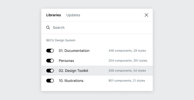
Library Usage Guidelines
The dos and don'ts of working with the Design Toolkit
Do's
- Use the components and their variants just as they are.
- If you notice something that can be better - or even something that is wrong in a component - contact the UX CoE team and provide feedback.
Don'ts
- In your projects, do not override text and color styles.
- In your projects, do not detach a component instance from their parent component.
- In the libray, do not make changes without reviewing with colleagues.